farmboy
Well-known member
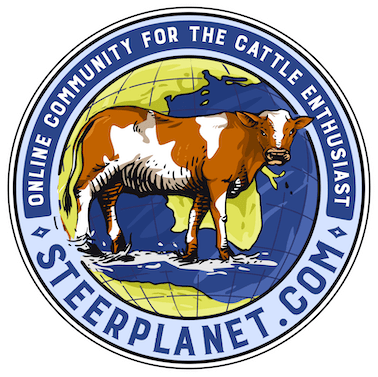
ANOTHER DUMB QUESTION...IS THERE A NEW BLUE STEER ON THE SP LOGO OR HAS IT BEEN THERE FOREVER ???
KINDA CAUGHT MY EYE
KINDA CAUGHT MY EYE

Gypsy said:I like the blue steer the best. That gets my vote. There are too many black steers in the world! Diversity is good. DL I think the blue and the black steers look kind of androgynous - like a lot of the show heifers. ;D
JbarL said:Gypsy said:I like the blue steer the best. That gets my vote. There are too many black steers in the world! Diversity is good. DL I think the blue and the black steers look kind of androgynous - like a lot of the show heifers. ;D
with the detail and size of the world logo in the back ground....the use of any of the cattle seem in sharp contrast( basic no detail in animal) to the oval detailed larger world logo ...and with the block STEER PLANET font and the angled .com .....well......
we seem to have a bit of a wreck....... try bringing out the detail of the world logo in the background as more prominent and mirror in your steer image ( outline image only ????) logo over top of only the word STEER in the STEER PLANET ......( just a bit smaller animal possibly)...the present scale of the whole design.( the cow is as big as have of north America)......is off i believe.....i dont think the colors are the area you need to be concerning on to figure out what is wrong....seems scale and depth to me....and now for the biggie.......doyou really think the " .com" is really necessary in the design for shirts and hats...most of the talk i have heard is to have shirts to recognize each other and meet members....the .com suggests an advertisement...which is OK if that is one of the the objectives.....but it seems that you all seem very willing to share any info and new " friends" can still be invited tothe site...... . but dropping the .com for design makes it even a bit more "less busy" and one less font size to scale with the size of the larger logo which is the world design........clear as mud??? jbarl